


Even though we humans might be using advanced technology with voice recognition and backlit touch-screen displays, we still depend on the same bodies and brains that our ancestors used thousands of years ago to allow us to act in our environment, no matter how digitally enhanced.
Andrew Hinton, Understanding Context
Technology can make magic happen. In seconds, you can find all the blue sandals in a warehouse of millions of shoes. A million people can read the same article without killing one tree. You can undo, unsend, and even unfriend! But here’s the buzzkill: if unanticipated or unwelcome, the magic of technology is confusing, disorienting, and unintuitive—a UX designer’s worst nightmare.
So how can we ensure that the magic we create is intuitive? Designers will often say, “If a design is intuitive, it behaves how a user expects it to.” Well, then … what do users expect?
We want to know the following whenever we find ourselves in a new environment (physical or digital):
- What are the objects?
- Where are the objects?
- How do these objects relate to me?
- How do these objects relate to each other?
- What is my role as an object within this environment?
In physical spaces, these don’t require explicit thought to answer. However, in digital spaces, they often do. That is because our “lizard brains”—the part of the brain involved in motivation, emotion, learning, and memory—evolved alongside the physics of solid objects. Consequently, users may feel unsure when designers flout the perceptual expectations forged in the physical world. Without knowing what and where the objects are, we feel blind. Navigating feels uncomfortable. Taking action might even feel impossible.
The remainder of this article introduces three ways to design digital objects that “play nice” with our evolved expectations of the physical world. By doing our best to concretize the dematerialized things of our screen-based world, we give our lizard brains better affordances for understanding.
Lesson one: avoid shapeshifting objects
The properties of user interfaces need to be consistent for us to learn them well. We hunger for stable landmarks in the often ambiguous maze of digital interfaces.
Andrew Hinton, Understanding Context
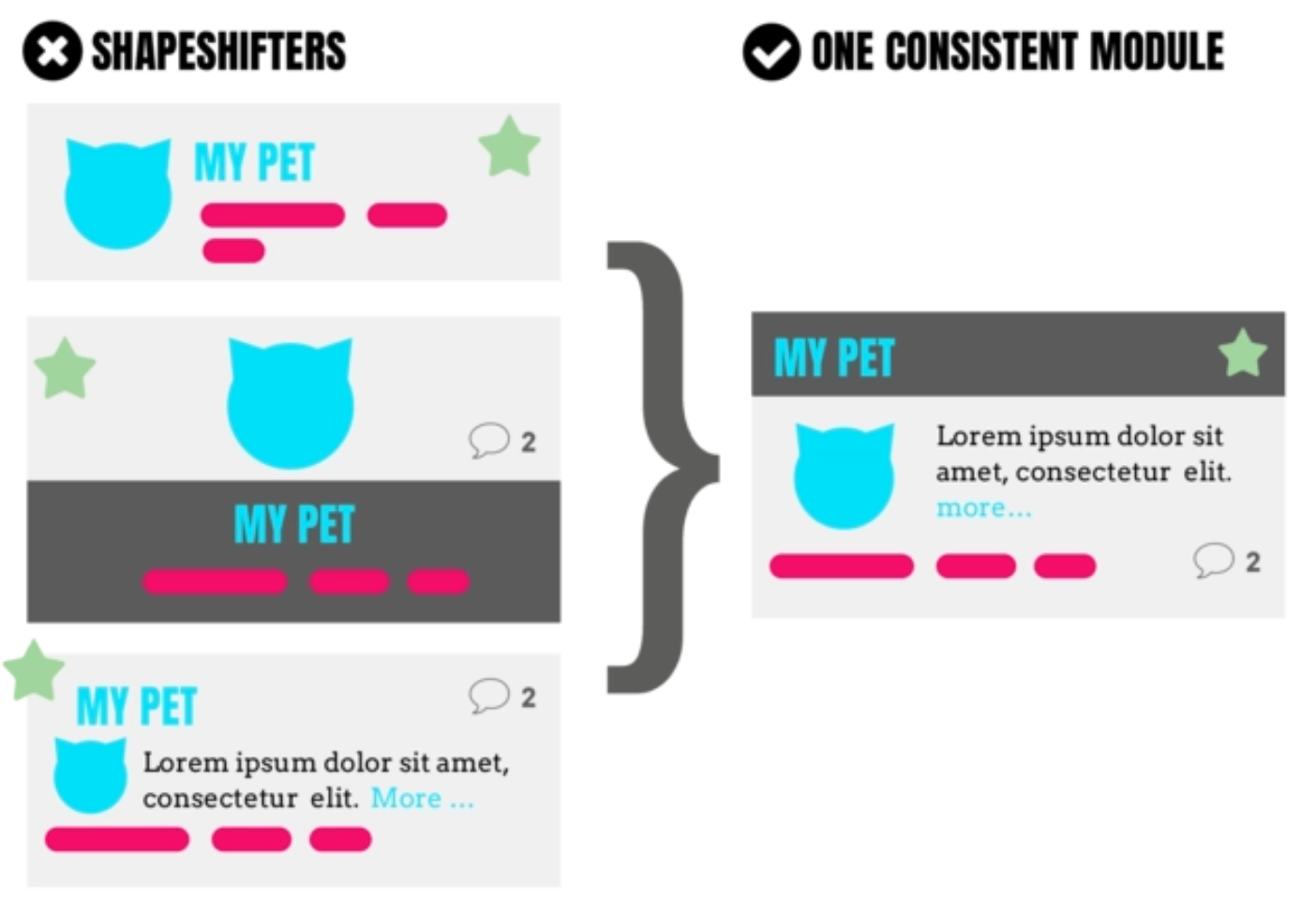
Objects in the real world don’t usually change form as they change context. When I bring a new toaster home from the store, it doesn’t change into a different toaster. When I remove a vase from the cabinet, it doesn’t turn into a coffee mug. Humans expect object permanence; we are taken aback when objects unexpectedly change shape.
Why do babies love peekaboo so much? It’s a great way to practice the fundamentals of object permanence, an important lesson in survival (e.g., just because the tiger went behind the rock does not mean it has disappeared). Because babies are still coming to terms with this concept, peekaboo makes for a rollicking good time. So we might assume that if we up the ante on the surprise-factor, the game would be even more fun, right? Nope. Researchers measuring the level of toddlers’ delight during a series of hacked games of peekaboo discovered that the game loses its appeal when a different face pops up after hiding. The older the child, the more this hack kills the game. Evolution seems to be telling us: it’s not cool when objects suddenly change. But all that peekaboo practice is for naught when trying to navigate a digital world of shapeshifting objects.
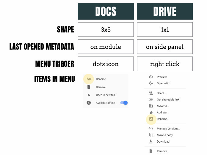
For instance, when this article was in the form of a Google Doc, it lived in both the Google Docs and the Google Drive environments. Depending on the environment, the article’s module changed form and function.
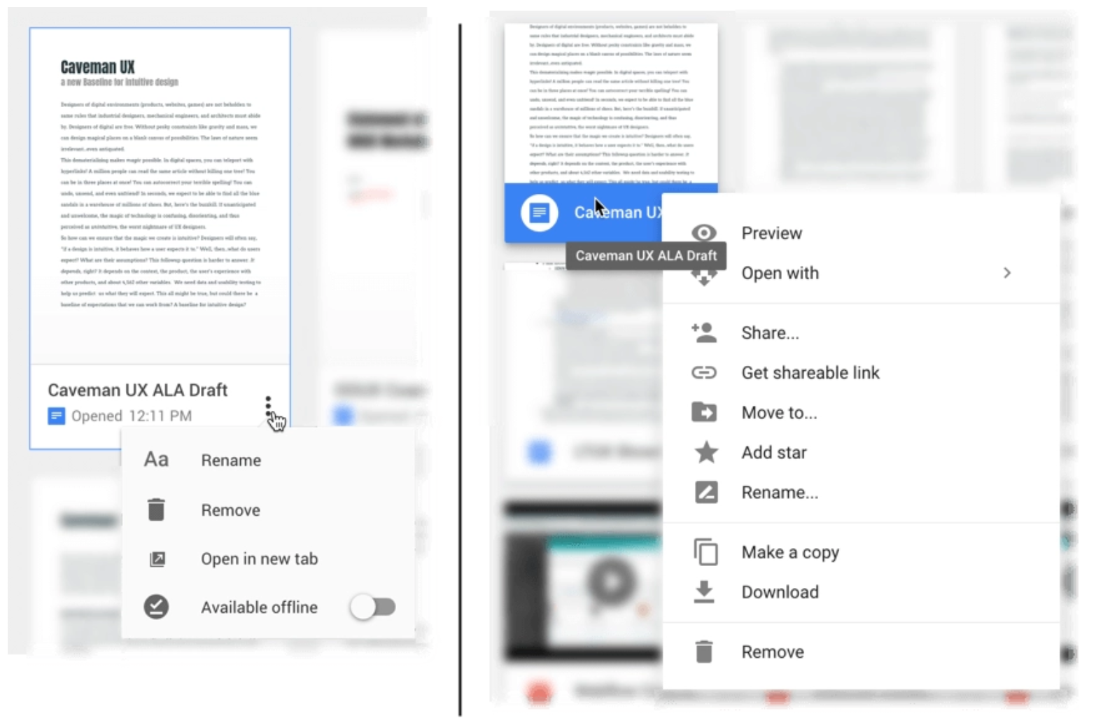
Moving from Docs to Drive, the shape of the document module shifts from about a 3:5 rectangular ratio to a 1:1 square ratio. If I want to see when I last opened a document, I will find that information directly on the module while in Docs; but within Drive, I must look to a disembodied side panel (not shown). Both modules have a menu of actions, but accessing it requires different interactions. (In Docs, I click the “more” icon; in Drive, I right-click the module.) Worst of all, the menu contains almost completely different options in each module! Only “Remove” and “Rename” are found in both menus. Adding insult to injury, even the icons for “Rename” are different.
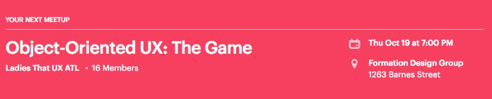
We could chalk up the inconsistencies of Google Drive and Google Docs to siloed teams, but shapeshifting objects are common within products, too. On Meetup.com, the digital representation of my next meetup morphs multiple times across the site. Looking at the homepage, it displays as a big red banner at the top of the screen.
Scrolling down the homepage to the calendar section, the same meetup is displayed as a white box sporting some green accents that signal my relationship with this particular object.
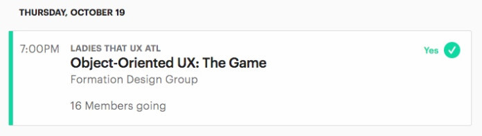
And finally, within the context of its parent group—in this case Ladies that UX ATL—the meetup object is represented differently yet again. (Let’s not even get started on the ontological ambiguity between Meetup the Group and Meetup the Event.)

Not only is my lizard brain trying to reconcile all these changes for potential threats, but these inconsistencies are making me work harder in a practical sense. I have to learn three displays for RSVP status, three positions for date and time, and three ways to find the number of people going. Every time the object changes, I have to make adjustments both to recognize it and to interact with it. These adjustments are small, but they add up across the experience. Designers can eliminate this cognitive load simply by creating a canonical object structure and sticking to it.
Many users don’t log the deltas between modules explicitly. Users furrow their brows and simply do their best to relearn objects and keep track of what’s what. They might harbor a vague feeling that the website or app is “hard to use.” Or worse, they blame themselves for “stupidly” attempting to interact with an object in a way that worked in one context but does not work in their current context.
Sure, there are complex platforms where it might make sense to re-prioritize object elements depending both on who is viewing it and under what conditions. But if we design screen-by-screen instead of object-by-object, we run the risk of doing this unintentionally and arbitrarily, introducing more shapeshifting than is absolutely necessary.
Key takeaway
When we move elements around within an object, we need to remember that we are making a sacrifice—we are sacrificing consistency. Sometimes it will be worth it, like perhaps in professional tools used by power users. But often, our users will be happier with a single, rock-solid representation of that object.
Lesson two: avoid masked objects
On the flip side of shapeshifters (i.e., various packages for the same object), designers also have a tendency to shove different objects into the same package. With the good intention of designing a system of reusable parts, we’ll often create one-size-fits-all modules. This might seem like a smart simplification strategy, but it actually hinders users from distinguishing various object types. Distinguishing them is critical for the user to understand the system.
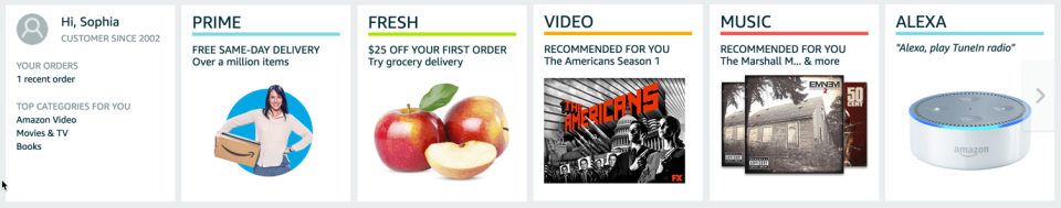
Check out this bank of candy-colored modules on my Amazon homepage. Sure they house different colors and content, but they follow the same basic structure. If the text were in Latin (or if the user were skimming rapidly, which we should always assume is true), these modules would translate as the same type of thing. In looking at the first two, PRIME and FRESH, I might get the impression that these modules represent “services.” And indeed, when I click these modules, I enter sort of informational, sale-sy pages describing these services (although they follow completely different templates).
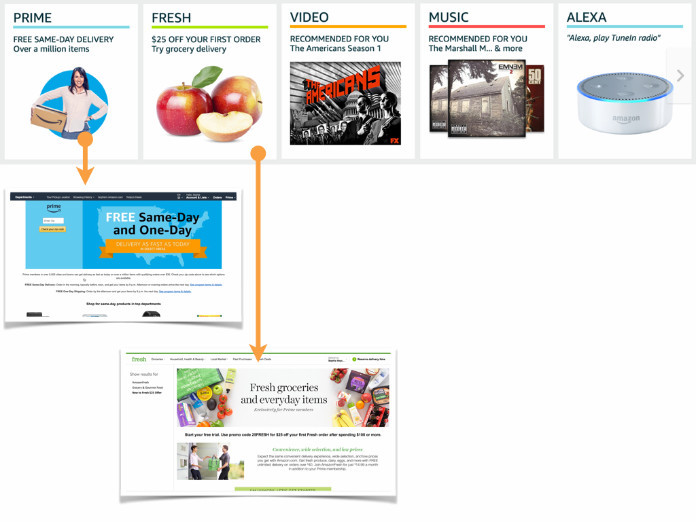
But when I get to VIDEO, I have to pause. VIDEO…the service? Or does this module represent a TV series? The next module (MUSIC) brings up the same question. And the ALEXA module—will this take me to a service landing page or, perhaps, a product detail page?
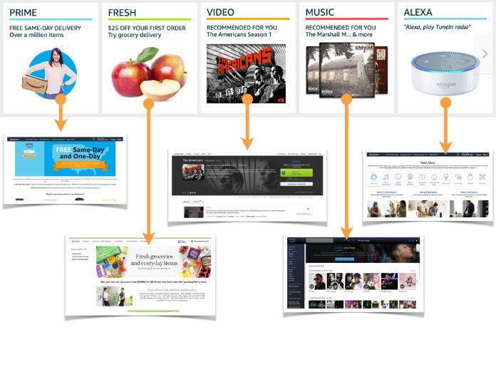
In fact, each module takes me to a different type of place. PRIME and FRESH take me to two separate templates for a “service.” VIDEO takes me to a detail page for The Americans. And MUSIC opens up Amazon Music in a new tab (with no sign of the ill-recommended Eminem album). The ALEXA module takes me to another “snowflake” landing page.
Like opening identical doors in a game show (but not as fun), I never know what to expect when clicking on one of these tiles. (View a video of my full rant on these Amazon modules.)
Let’s look at one more example. The Apple App Store leverages a small rectangular thumbnail module that can house apps, curated collections, broad categories, developer-based app suites, and even operating system updates.
The same module represents various objects in the Apple App Store.
In both the Amazon and Apple App Store examples, instances of the modules have distinct graphics and labels, but they are the same shape and size and they are grouped together, like apples at the market. As a general rule of thumb in Gestalt psychology, when objects are grouped together, we assume they are the same type of thing, especially if their overall shape is identical. When the same packaging (i.e., the module) turns out to contain various types of things, as in the App Store, users may feel confused or even tricked. This is like taking a sip from your Starbucks coffee cup and getting a mouthful of orange juice: objectively tasty, but if unexpected, you might spew it onto your barista.
Key takeaway
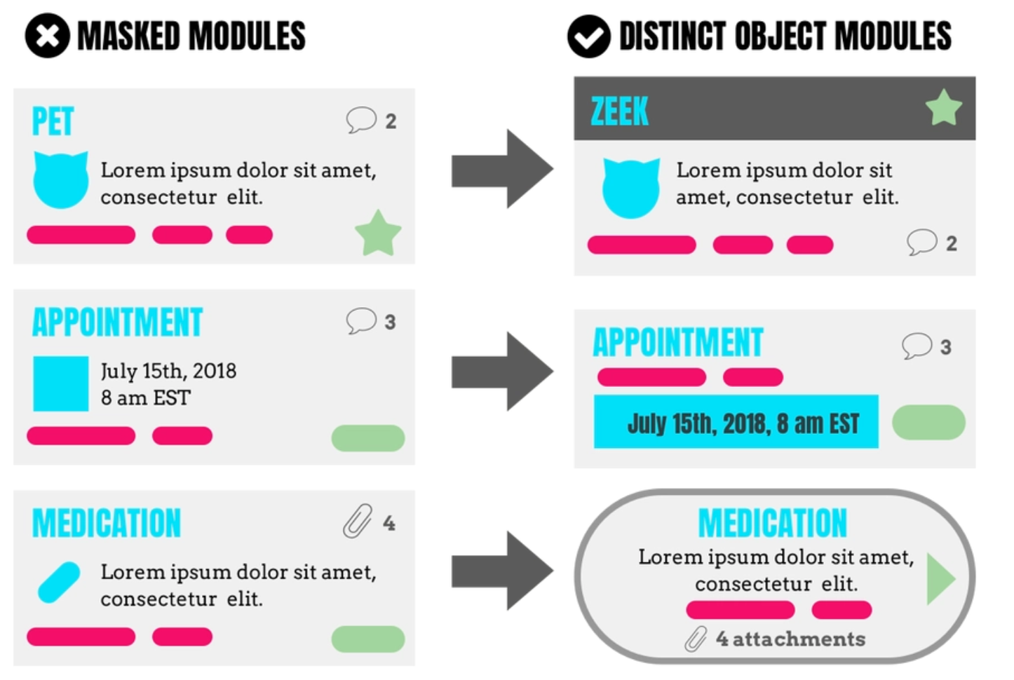
Designing one-size-fits-all modules might seem like a good idea for an efficient modular system, but this practice doesn’t allow users to predict what’s “behind the door.” Instead, design packaging (i.e., modules) that reflects the unique things inside. This way users can learn to recognize and understand the objects in your system, making for a more intuitive environment.
Lesson three: avoid broken objects
(This section has been updated July 27, 2021. In the original article, I was calling these "broken objects" and since then had an updated definition of a broken object in the OOUX world. To see updated examples of broken objects and also a forth kind of unintuitive object, the isolated object, check out this 90-minute free training on the four UX mistakes you don't know your making.)
In the real world, our environments are made of surfaces and clear edges. We rarely have the problem of understanding where one object stops and another begins. If we happen across a tangle of snuggling kittens, our brain might freeze up—not only from cuteness overload, but also because we are compelled to figure out which paws belong to which head. We want objects to be whole; if they are not, our brain does its best to connect the dots. In digital environments, an object might not only shapeshift across screens or mimic other objects, it might also be broken. The information and interaction triggers of broken objects are scattered across their digital environments.
Winc Wines, a lovely service that delivers algorithmically-recommended wine to your doorstep, prompts customers to rate their wines. Often, I’ll do this 3–4 months after receiving wines. Recently, I decided it would be a great form of procrastination to log into Winc to rate my past wines.
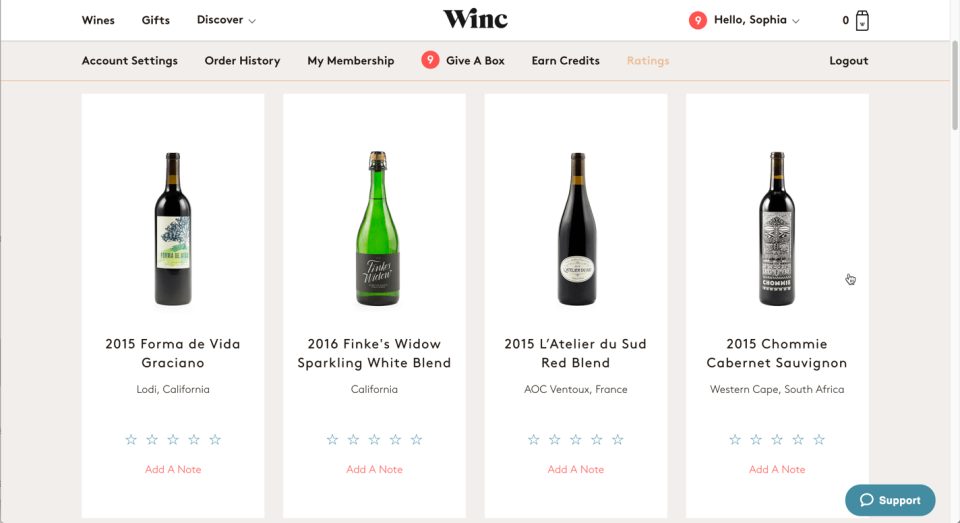
At a dinner party I hosted in May, we drank a delicious sparkling wine. I think it was Finke’s Widow, but I’m not positive. Hesitating to give it five stars until I am sure, I need to find out when the bottle of Finke’s was delivered. On the “Ratings” tab, I see all my past wines. But delivery dates are not displayed.
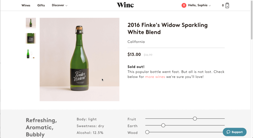
Clicking into the detail view, I am presented with a generic detail page, the same view of Finke’s Widow that everyone sees. Here I can find information about the wine, but no information about my relationship with the wine—mainly, when it was delivered and how (or if) I rated it.
As a wild guess, I click the “Hello, Sophia” menu, where I see a link to Order History. Seems promising.
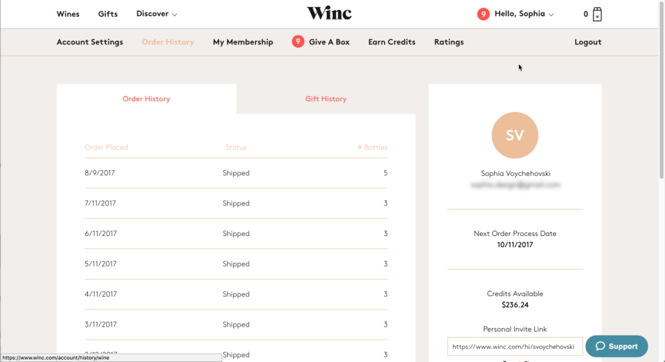
The Order History page gives me a list of orders with no preview of the wines that were included in each order.
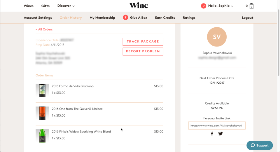
After clicking into the April and May orders, I finally find Finke’s Widow. Mystery solved. So, can I rate the wine from here? Nope! I have to navigate back to the Ratings tab and then scroll down to find Finke’s Widow again. In the Winc world, relevant pieces of a bottle (like a customer’s order date, rating, and tasting notes) are scattered about, forcing a user to hop around to piece together the broken object. (Watch a video of this screen-hopping.)
Key takeaway
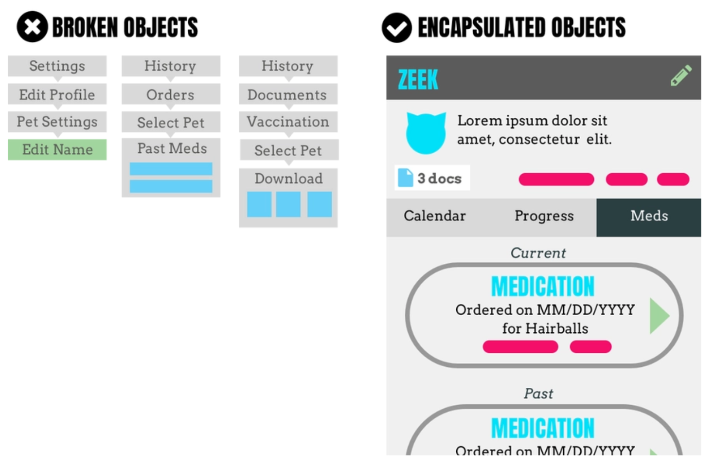
In the Winc world, I have to be in Order History to see a wine’s delivery date and I have to be in Ratings to tell the system how much I liked a bottle of wine. But what if I am browsing wine and one of my past wines shows up in a curated collection? I’ll want to be reminded that this wine was delivered to me six months ago and I gave it 4 stars. Or, if I haven’t rated it yet, but I remember loving it, I’ll want to add my stars then and there. I definitely do not want to navigate over to Ratings, only to have to scroll down to re-find that bottle.
We need to do our best as designers to encapsulate our digital objects, making them feel whole and directly manipulable, just like in the real world. I might be more likely to use the blender in the kitchen, but it still works just as well in the garage.
Building a better mind palace
Humans love to concretize things. Greek orators memorized their long speeches by visualizing the speech as rooms in a palace. Sherlock Holmes himself, a genius at making connections between the most subtle clues, did so by entering his mind palace, a visualized place where bits of information were concretized and manipulable.
If the internet is the chaotic product of the human genius, this article is a call to action for designers to build a stronger mind palace for it. When we avoid shapeshifting, masking, and breaking digital objects, understanding will emerge more naturally. It’s a simple matter of making our digital environments feel a little more like the real world in which our ancestors evolved.
---
Originally published on A List Apart


